
🎧 Listen on: Apple Podcasts | Spotify
Design isn’t just how your brand looks. It’s how it speaks. Before anyone reads a word, your visuals are already doing the talking. Your colors, fonts, logo, and layout are setting the tone, creating expectations, and shaping perception—in literal milliseconds.
So if you’ve been treating your visual identity like an afterthought, let this be your wake-up call because what people see is telling them more about your brand than what you say ever will.
Your Design Is Talking….But What Is It Saying?
We love to think people read everything we post online. But let’s be real, they’re skimming, scrolling, and only half-paying attention.
That means your visuals are often the first and sometimes the only impression you get to make.
So here’s the tough love: If your design looks thrown together, chaotic, or inconsistent, that’s the message you’re sending (whether you meant to or not).
Your audience sees that and thinks:
- “This looks DIY.”
- “This doesn’t feel like a fit for me.”
- “This feels outdated or unprofessional.”
…all before they ever read your caption, sales page, or offer description.
The Coffee Shop That Has Me in An Unexpected Chokehold
Let’s talk about Blank Street Coffee.
I was in NYC recently, caffeine-deprived and on the hunt. Sure, there were plenty of Starbucks and Dunkins on every corner, but I wanted a vibe. And when I saw Blank Street, I knew I had to go in. I didn’t know what was on the menu, but I knew at first glance, “this is my kind of place.”
I walked in. Fell for the aesthetic. Ordered something called the “Daydream Latte.” Took one sip and immediately thought, “This might be the best latte I’ve ever had.”
But….was it actually? Or did my brain decide it was going to be, before I even tasted it?
Enter: Confirmation Bias (aka Your Branding’s Secret Weapon)
Confirmation bias is a psychological phenomenon where our brains seek evidence to support what we already believe or expect. So because the design of that shop told my brain, “This is high-quality, intentional, and made for someone like you,” I subconsciously started looking for proof that the experience would deliver.
The branding built trust. The environment set the mood. And the latte just had to live up to the story already forming in my head.
That’s how branding creates belief.
And it works the exact same way with your business.
Your Visual Identity Shapes the Story People Tell Themselves
Whether you’re a photographer, esthetician, coach, or copywriter, your visual branding is shaping perception before your work ever speaks for itself.
That means:
- The vibe of your website matters.
- The mood your Instagram feed gives off matters.
- The way your logo, fonts, and brand colors make people feel? Yeah, that matters too.
Because your visuals are setting expectations. And expectations influence experience.
Think of It Like This…
Imagine the words “coffee shop” written in two different ways:
- A bubbly, pastel font with sparkles and doodles
- A sleek, modern serif in soft beige against a deep forest green
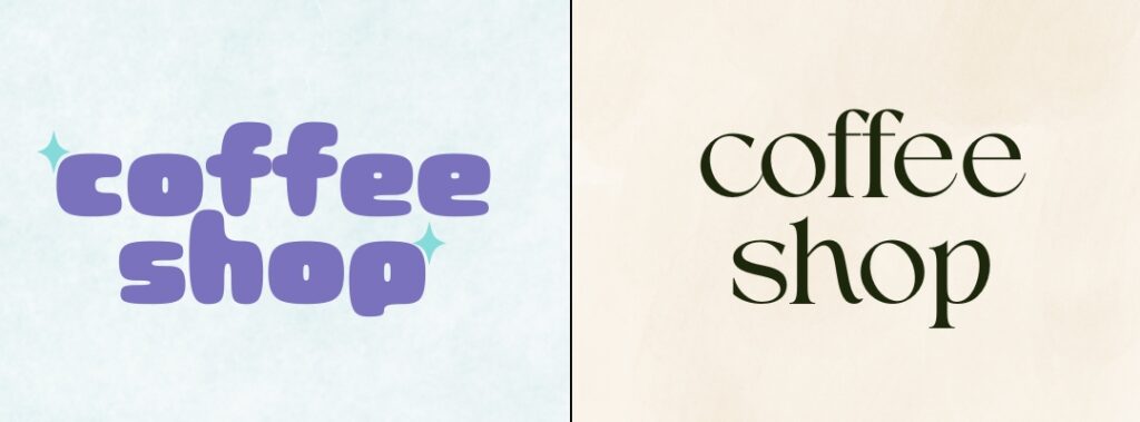
Same word. Very different message.
One says “fun and playful.” The other says “premium and calm.”
This is why design is communication.
Because even when the message is the same, the presentation shapes how it’s received.
5 Ways Your Visuals Might Be Sending the Wrong Message
Let’s break it down. If your content is falling flat, it might be because your branding is doing one (or more) of these things:
1. Looking DIY or Mismatched
Inconsistency screams “not ready” or “unpolished.” You want your brand to feel intentional, not like it was pieced together with free templates and guesswork.
2. Clashing With the Emotion You Want to Evoke
Trying to be the go-to calming expert with loud neon graphics? That’s a disconnect.
3. Using Trends Instead of Strategy
Trendy fonts and colors are cute…but if they don’t align with your brand personality or audience, they’ll work against you.
4. Telling the Wrong Story
If your brand visuals scream “budget” while your offer is high-touch and premium, people will assume you’re overpriced, even if your value is incredible.
5. Creating Confusion Instead of Clarity
Design should guide the eye and clarify the experience, not overwhelm or distract.
People Don’t Buy the “Best,” They Buy What Feels Right.
And feeling is a design-driven decision. You could have the most impactful, life-changing offer in the world, but if your visuals don’t support that level of transformation? You’re losing people before they even give you a chance.
Great branding creates emotional alignment.
It tells people, “This is for you,” and it sets the stage for your content to land, ensuring your offer looks as good as it actually is.
TL;DR Design Is Communication
If you’ve been focusing on what to say without paying attention to how it looks, your message might be getting lost in translation.
Let’s recap:
- People skim. Your visuals speak first.
- Your brand identity sets expectations and triggers emotion.
- Confirmation bias means design influences how your offer is perceived and experienced.
- Misaligned or inconsistent visuals confuse your audience and cheapen your brand.
- When you design with intention, your brand feels like the experience you want to deliver.
Want to dive even deeper? Check out the latest episode of Your Brand Is Showing.
🎧 Listen on: Apple Podcasts | Spotify
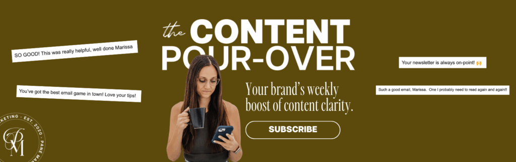
Looking for more content and brand strategy tips?
Every Wednesday morning, I break down one smart, strategic idea to help you show up online with more clarity, more confidence, and a brand your best-fit clients can’t stop thinking about.
Each email offers a practical reframe, built on strategy, buyer behavior, and what actually works online right now.
→ Subscribe to The Content Pour-Over to make sure when your brand is showing, it’s saying exactly what you want it to.