


Let’s talk about how to improve your digital product’s sales pages quickly and effectively with psychology and neuromarketing research.
From product mockup placement to pricing psychology hacks, I’ll be sharing some of the best tips and tricks to help you optimize your sales pages in order to boost your digital product sales.
So whether you’re a data-driven nerd like myself or you’re just starting out in your business and are ready to get a leg up on your competition, stay tuned for this episode full of valuable insights and actionable tips to take your sales page to the next level.
Resources Mentioned:
- Content Catalyst Membership
- Check out the Pané Marketing Blog
- Message me on Instagram
- Connect with me on LinkedIn
Research + Studies Mentioned
- 10 Useful Findings About How People View Websites
- Make your product “shine”
- Include Multiple items in your mockups
- Display your pricing below
- When to use horizontal vs vertical product layouts

Did you know that the average user spends only 52 seconds on a webpage? And when first viewing a website, it actually takes a user less than two-tenths of a second to form a first impression?? (According to eye-tracking research by the Missouri University of Science and Technology)
That means your sales page has to capture their attention and convince them to take action in a matter of seconds.
Luckily, there’s a wealth of research out there on what works and what doesn’t when it comes to creating high-converting sales pages. From product mockup placement to pricing psychology hacks, I’ll be sharing some of the best tips and tricks to help you optimize your sales pages in order to boost your digital product sales.
So whether you’re a data-driven nerd like myself or you’re just starting out in your business and are ready to get a leg up on your competition, stay tuned for this episode full of valuable insights and actionable tips to take your sales page to the next level.
Fun fact: first impressions on websites are 94% design related.
During the early 2000s, a study conducted in the UK discovered that the majority of website evaluations were based on the perceived design of the site, rather than its actual content. It was revealed that the visual aesthetics and navigation of a website were the primary factors influencing the initial impression of visitors.
And honestly, as a girl who had to choose between 4 books in college to write a report on…and her decision was solely based on the cover design, not the topic or anything relating to the actual contents of the book… and who then had to write a report on why she chose the book and confessed to it being solely because she didn’t want to read an ugly book…this study made me feel a little less crazy.
Design matters. To everyone. Not just teenage girls in art school prioritizing cover design over the actual content.
But here’s the thing when designing digital experiences like sales pages or landing pages, it’s important to remember that users are constantly bombarded with visual stimuli. 100 billion pieces of information coming in every second is a LOT to process.
So in order to capture a user’s attention, it’s helpful to understand the underlying cognitive processes occurring in the brain.
If you haven’t already heard of it…Neuromarketing is a fascinating field that I can’t stop learning about.
Essentially, it’s all about uncovering the underlying subconscious factors that influence consumer behavior, including decision-making, brand perception, and emotional responses to marketing messages through neuroscience.
By understanding these factors, we’re able to develop more effective marketing campaigns and optimize our sales pages to increase conversions.
For example, I’m sure you already knew that certain colors can evoke specific emotions.
Like how blue is often associated with trust and reliability, while red can stimulate excitement and urgency.
Or how the font you choose can influence how your message is perceived.
But what’s really fascinating is how neuromarketing involves the use of various techniques like fMRI’s, EEG’s and eye tracking to measure brain activity, physiological responses, and eye movements when consumers interact with marketing messages.
Clearly, we’re not scientists and can’t do firsthand research, but what we can do is implement the findings of others into our work and start to a/b test.
Here are a few researched-backed tips to keep in mind when building out your sales pages:
1 – People scan websites in an F-shaped pattern, with the top and left sides of the page receiving the most attention.
So we obviously want to place important information in the areas where users are most likely to look, so keep your key info (like navigation and value proposition) visible and easily accessible on the top and left side of the page.
2 – Large, high-quality images attract attention and can increase engagement BUT people tend to ignore generic or stock images, so custom images that are relevant to the content are more effective.
If you’re worried that your products are digital and that you can’t technically take photos of your product, think about using mockups within stock photography. So as opposed to just showing a standard image of a woman on a computer. Integrate your digital product onto the screen of the computer that the woman’s using.
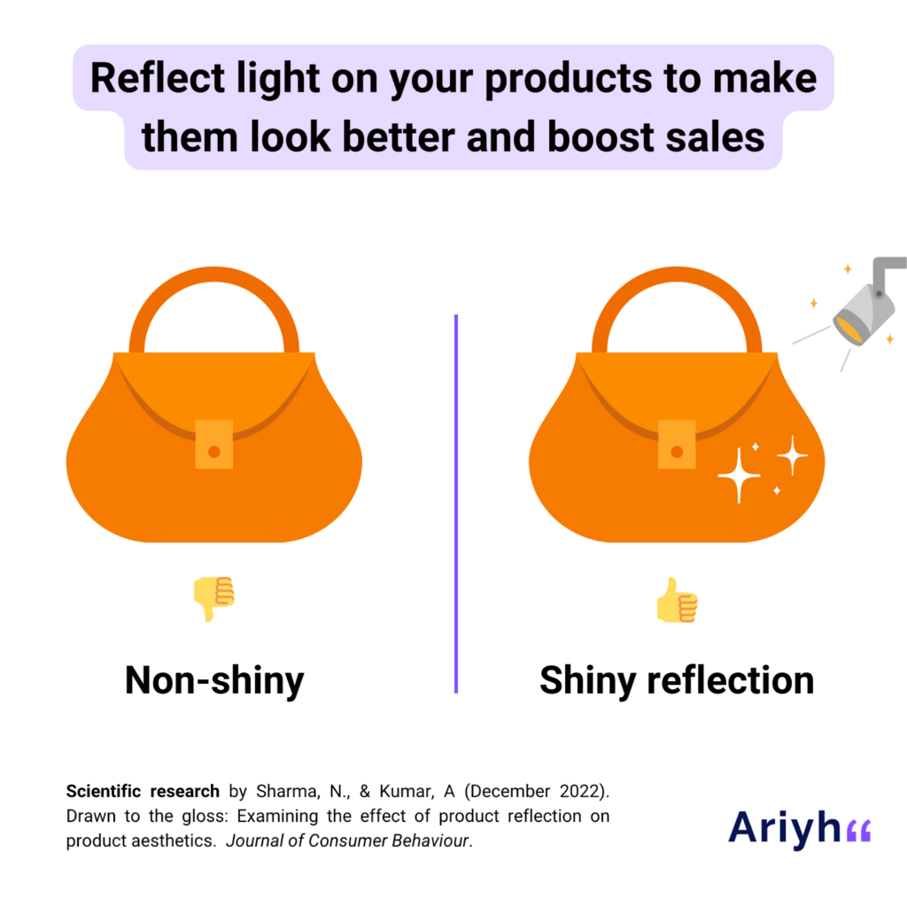
2.1 – A tip to enhance your product mockups is to make your products shine when possible as opposed to being a flat, non-reflective image.
According to research from the Journal of Consumer Behaviour, attraction to shiny objects is one of our core human instincts so we’re more drawn to them vs. if we were to see an object without that shine or light reflection. Interestingly enough this originated in humans because of water…as we’ve always needed to look for clean, pure, shiny freshwater in order to survive.
Pretty cool right?? Something as simple as needing water to survive and knowing that it’s reflective carried into our evolution and now subconsciously, all we have to see is a product ‘shining’ and we’re instantly more attracted to it. Wild.
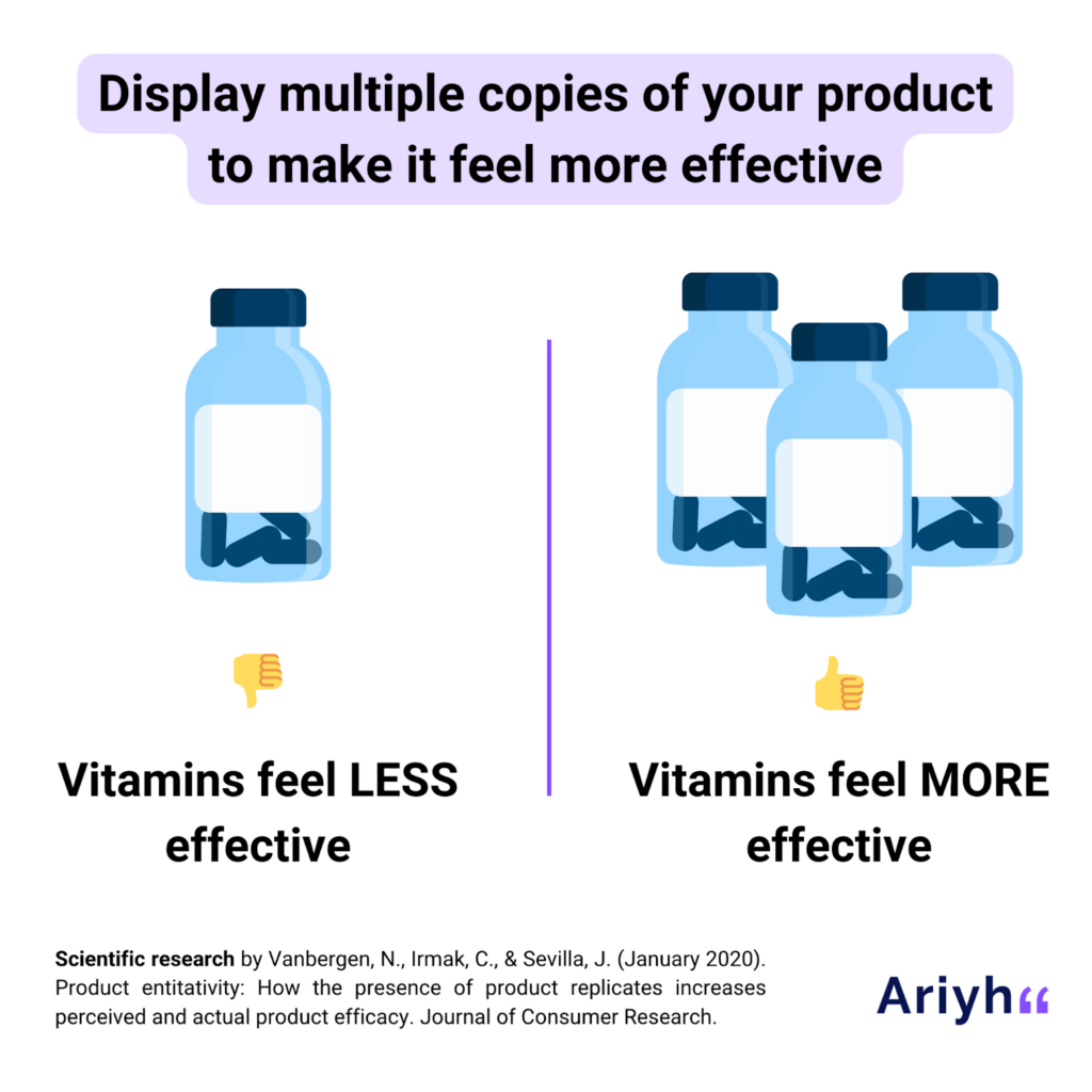
2.2 – Another fun fact is that you should never display your product alone. According to the Journal of Consumer Research, when we show a product alongside copies of itself – whether that be digitally or in-store, people will perceive it as more effective.
For whatever reason when we see multiple identical products together, we perceive them as a unified group. The unified group then feels more effective than the sum of its parts at getting the job done.
This may be why we get skeptical of products when they’re the last ones on the shelf at the grocery store… they’re missing their group so we instantly think something has to be wrong with the only one standing.
Interesting right? Something to think about and definitely an easy tip to implement on your sales page. No more lonely product mockups! Start building out multiple versions for optimal results.
3 – Faces and eye gaze are powerful cues that draw attention and can influence behavior.
If you have a photo of yourself looking out into the distance, position yourself to be looking at the headline on the webpage. This will draw the users’ attention to specific parts of a website that the person on the webpage is looking at.
You’ve probably seen this approach on countless landing pages where there’s only one action to perform and of course, the background image is someone looking directly at the opt-in box.
I actually took advantage of this little psychology hack on the first version of my website and LeadPages, the platform I used to build my site, started to include my website in their Best Practices presentations for new users building their websites on their platforms. I didn’t even know about it until I randomly attended an event and had that “oh shit, it’s me!” moment when my website was on the screen.
Totally made me feel like a rockstar when in reality, I was just winging it and utilizing the bare minimum of psychology knowledge to my advantage. So YES even if you only remember one tiny thing from today’s episode… implement it! You never know how much impact one tiny change can make.
4 – White space around text and images can increase user attention and comprehension.
White space, or the empty space between design elements, can help to create a more visually appealing and easy-to-read website. By using white space strategically, you’ll be able to increase user attention and comprehension all while making a website more appealing.
And while I’m on this hill, this goes for your graphics and social media posts and everything else you design too. PLEASE include more white space on your designs.
That’s the biggest issue I see happening with people who are DIYing their work without any sort of design background. They push content to the edge of the frame, they cram 10 pounds of shit in a 5-pound bag, and they don’t optimize for where this image is being viewed.
Stop it. Just remember less is more.
No one can read your graphics when everything is crammed in tight and no one wants to read your graphics when you’ve made it increasingly difficult to understand.
As a user people are thinking “What do I read first, why does this one line look important but mean absolutely nothing to the actual message? I’m confused” and then they bounce.
You don’t get a second chance. Bringing it back to what was said at the beginning of this episode, it takes a user less than two-tenths of a second to form a first impression. That’s really all the time you have to entice someone to interact or look deeper at the content you create, so start utilizing more white space and it may be your saving grace.
5 – Users expect clickable elements like links or buttons to look a certain way (e.g. the most basic example of blue and underlined hyperlinks), so following established conventions can improve usability.
This doesn’t mean you have to only use that blue underlined look. It just means you need to stay consistent with your link and button choices to improve usability and make it easy for your users to interact in the way you want them to. So choose a color for your buttons and stick with it throughout the whole sales page.
6 – Another layout tips for you: Shorter paragraphs and bullet points make the text more scannable and easier to read.
Hint: this actually goes back to the white space topic. But when text is presented in long, dense paragraphs, it can be difficult for users to scan and find the information they’re looking for. So break up the text into short paragraphs or include bullet points to make sure your content is easily digestible.
Simple.
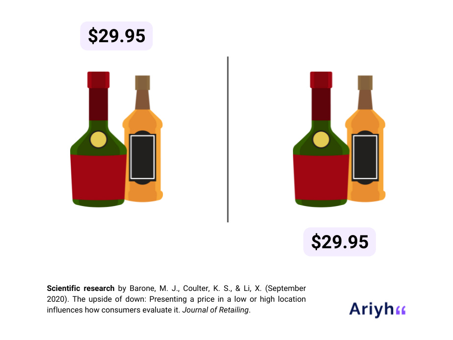
7 – Okay, now for a more fun layout hack. Prices shown in low (vs high) positions – compared to the product being sold – seem lower.
By placing the product price BELOW the product, you’re able to increase sales without hurting quality perceptions of the product.
If you’re wondering how the f this works, this is what the Journal of Retailing had to say. When we see a price in a low vertical position, we associate “down” with “less” and perceive it as a smaller number than what it is. In the same regard that we associate “up” with “more.” Being that these metaphors are ingrained in most of us as a concept, it holds true.
However, there is additional research that shows that this little hack won’t work for more expensive products. So if you have a low-ticket product, THAT’S the one you’ll want to try this pricing technique out on.
8 – One final pricing placement tip is that horizontal product displays on websites make people choose higher quality, more expensive products. Where vertical displays encourage choosing cheaper options.
According to the data collected by Ariyh, this works because we can be primed to think in two main ways:
Abstract, high-level thinking. Which means we think more about a product’s benefits and the “why” we would want it. This tends to be related to product quality.
Or concrete, practical thinking. Which means we focus on whether it’s achievable and “how”. This tends to be related to the product price
Therefore when looking at product placements, Horizontal displays of products encourage us to think in an abstract way, so we focus more on product quality and its high-level main features.
Whereas Vertical displays of products make us think in a more practical, detailed way, so we focus more on price and pay more attention to secondary features.
Super interesting right?!
Well, that’s a wrap, we just covered ten different psychology and neuromarketing hacks to help you optimize your sales pages in order to boost your digital product sales.
So now the question is which tip will you implement first?
And of course, I’d love to hear about the results! So be sure to send me a DM on Instagram @pane.marketing or connect with me on LinkedIn to tell me all about it.
Looking for more content and brand strategy tips?
Every Wednesday morning, I break down one smart, strategic idea to help you show up online with more clarity, more confidence, and a brand your best-fit clients can’t stop thinking about.
Each email offers a practical reframe, built on strategy, buyer behavior, and what actually works online right now.
→ Subscribe to The Content Pour-Over to make sure when your brand is showing, it’s saying exactly what you want it to.
